So far the reading list has drawn a phone layout everywhere: one screen at a time, even in a desktop window three times as wide as a phone. This post makes the user interface adapt. On a wide window the list and the open book share the screen; on a narrow one they take turns. It also moves every word of the UI out of the code into string resources, with a German translation, and looks at the one part of the UI that is not the same everywhere even though the code is: how text is drawn.
Each of these was measured on the desktop JVM, in Chrome and on an Android 16 emulator. Fifty-five window widths, two languages and eleven samples of writing later, there was one crash, one sentence that would not translate, one layout bug, and one surprise about where the web build gets its fonts.
1. Two Panes When There Is Room
With Navigation 3 (from the previous post), a layout that shows several back-stack entries at once is a scene strategy. Material’s adaptive library provides one for list and detail. Each entry says which pane it belongs to, and NavDisplay decides from the window whether the list stays visible beside the book:
val listDetail = rememberListDetailSceneStrategy<NavKey>()

NavDisplay(
    backStack = backStack,
    sceneStrategies = listOf(listDetail),
    entryProvider = entryProvider {
        entry<BookList>(metadata = ListDetailSceneStrategy.listPane(detailPlaceholder = { ChooseABook() })) { … }
        entry<BookDetail>(metadata = ListDetailSceneStrategy.detailPane()) { route -> … }
    },
    …
)
The back stack does not change: it is still [BookList, BookDetail(2)]. Only the presentation does. Three small things changed with it.
- Choosing another book replaces the book. Beside the list, a reader clicks through books; pushing each one would make back step through all of them.
Navigator.open()now replaces a book with a book (and, in the browser, useshistory.replaceState), so one back press returns to the list. A new test incommonTestchecks it. - No back button beside the list. The book’s ”← All books” button makes no sense when the list is already there. The app asks the same question the strategy asks,
calculatePaneScaffoldDirective(currentWindowAdaptiveInfo()).maxHorizontalPartitions > 1, and hides it. - The open book is highlighted in the list, which only matters when both can be seen.
2. Where the Second Pane Begins
Window widths are grouped into three width size classes: Compact (below 600 dp), Medium (600 to 840 dp) and Expanded (840 dp and up). The Navigation 3 documentation’s reference implementation of a list-detail scene switches at Medium. Material’s strategy decides through calculatePaneScaffoldDirective, and the only way to know for certain where that lands is to measure it.
The app was opened on a book and its window set to every width from 320 to 1400 dp in steps of 20: by a JVM UI test on the desktop, by resizing Chrome’s viewport, and on Android by overriding the emulator’s display (wm density 160, so that one pixel is one dp, then wm size).
| Platform | One pane | Two panes |
|---|---|---|
| desktop JVM | up to 820 dp | from 840 dp |
| web (Chrome) | up to 820 dp | from 840 dp |
| Android 16 | up to 820 dp | from 840 dp |
All three agree, and all three switch at Expanded, not Medium. Two consequences were measured, not assumed:
- A phone in landscape stays at one pane. The emulator’s Pixel 4 profile is 829 dp wide in landscape, 11 dp short of the breakpoint, and showed only the book after a real rotation.
- The app embedded in this page depends on the reader’s window. The iframe below is 850 px wide when the browser window is 1920 px wide (two panes) and 790 px wide in a 1440 px window (one pane).
3. Strings Out of the Code
Every visible word now lives in commonMain/composeResources/values/strings.xml, with a German copy in values-de/. Compose Multiplatform generates a Res class from them, so a missing string is a compile error rather than a blank label:
<!-- values/strings.xml -->
<string name="app_title">Reading list</string>
<plurals name="read_count">
    <item quantity="one">%1$d of %2$d book read</item>
    <item quantity="other">%1$d of %2$d books read</item>
</plurals>

<!-- values-de/strings.xml -->
<string name="app_title">Leseliste</string>
<plurals name="read_count">
    <item quantity="one">%1$d von %2$d Buch gelesen</item>
    <item quantity="other">%1$d von %2$d Büchern gelesen</item>
</plurals>Text(stringResource(Res.string.app_title))
Text(pluralStringResource(Res.plurals.read_count, list.size, list.count { it.read }, list.size))Each platform picks the language itself: Android from the system or the app’s own language setting, the web from navigator.language. Both were checked by switching the language and reading the screen back. On Android this used the per-app language setting (cmd locale set-app-locales … de-DE); in Chrome, a page whose browser language is de-DE:
| English | German | |
|---|---|---|
| Android 16 | ”1 of 3 books read · running on Android 16 (API 36)" | "1 von 3 Büchern gelesen · läuft auf Android 16 (API 36)“ |
| web | ”1 of 3 books read · running on Kotlin/Wasm" | "1 von 3 Büchern gelesen · läuft auf Kotlin/Wasm” |
Two problems turned up on the way.
The first German screen said “läuft auf the browser (Kotlin/Wasm)“. platformName() is an actual in each platform’s source set, and its English never passed through the resources. Text built in platform code escapes translation. The platform names are now proper nouns only (“Kotlin/Wasm”, “JVM 21.0.12.1 · Mac OS X”). For the same reason, the web’s warning about another tab is no longer a sentence produced in wasmJsMain, but a StorageWarning value that the common UI turns into words.
On Android, the app crashed on start, in every language. The desktop and web builds worked. On the emulator, the very first string threw:
org.jetbrains.compose.resources.MissingResourceException: Missing resource with path:
composeResources/dev.fauzisho.readinglist.resources/values/strings.commonMain.cvr
The APK had no Compose resources at all. AGP’s KMP library plugin, used by the shared module since the first post, switches Android resources off by default, and Compose resources travel with them. One line fixes it:
kotlin {
    android {
        androidResources { enable = true }
    }
}
It compiles either way, so nothing short of running the Android app finds this.
4. The Same Text, Drawn Four Ways
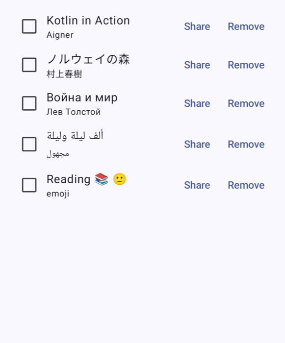
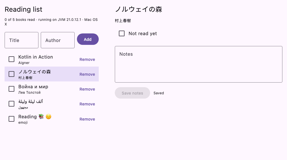
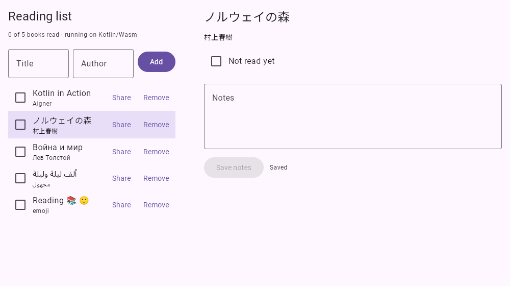
The UI code is shared, but the text in it is drawn by different engines: Android’s own text stack on Android, and Skia, with Compose’s text layout, on the desktop, iOS and the web. The obvious difference is fonts. Android and the desktop have the operating system’s fonts to fall back on. A web page drawing into a canvas has none.
The same five titles (Latin, Japanese, Cyrillic, Arabic and emoji), drawn four times. Android 16, from the system’s Noto fonts:
The desktop (macOS), from the system’s fonts, with Apple’s emoji:
The web, in Chrome:
The web, behind a Content Security Policy that only allows the page’s own origin (more on this below):
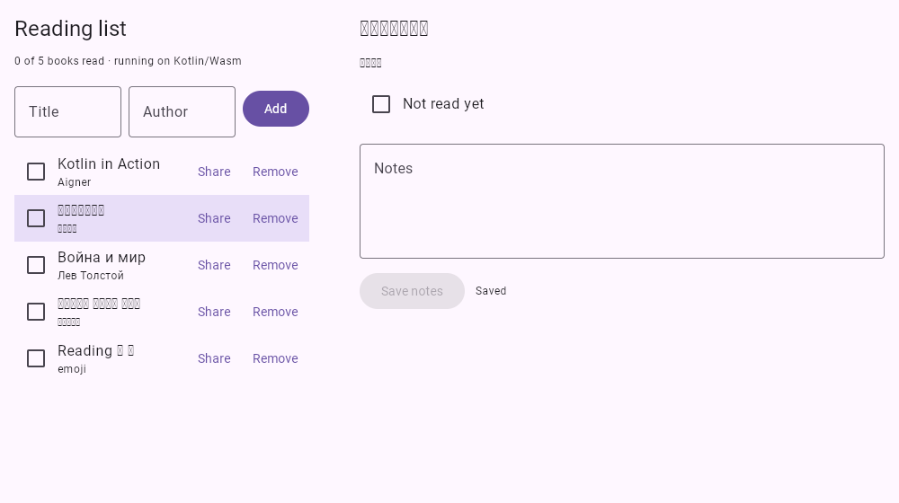
The web build drew every script, which was not expected. The page’s network traffic explains how. Compose Multiplatform for web, when it meets characters its built-in font does not cover, downloads a matching subset of Google’s Noto fonts from fonts.gstatic.com and redraws. Measured with one title per writing system, each in a fresh browser profile:
| Script | Files from Google | Downloaded |
|---|---|---|
| Latin, accented Latin, Greek, Cyrillic | 0 | 0 |
| Hebrew | 1 | 7 KB |
| Korean | 3 | 25 KB |
| Devanagari | 1 | 43 KB |
| Japanese | 1 | 45 KB |
| Arabic | 1 | 49 KB |
| Chinese | 3 | 65 KB |
| Emoji | 2 | 302 KB |
It works, and it has three consequences worth knowing.
- The reader’s browser contacts Google. A request for a font sends the reader’s IP address to Google, and the page did not ask. In Germany, the Landgericht München I held in 2022 (3 O 17493/20) that a website passing visitors’ IP addresses to Google through Google Fonts without consent infringed their rights, and awarded damages. Whether that applies to a given app is a legal question; that the request happens is a measured fact.
- Offline, or behind a strict policy, the characters are empty boxes. With
connect-src 'self'; font-src 'self'in the page’s Content Security Policy, no request reached Google (the browser logged 6 to 18 blocked attempts per script), and Japanese, Arabic and emoji were drawn as boxes. Latin, Greek and Cyrillic were unaffected. - Japanese was drawn with a Chinese font. For “ノルウェイの森”, the file that came back was Noto Sans HK, the Hong Kong Chinese variant. Japanese and Chinese share many characters but not all of their shapes, and a Japanese reader can tell.
In Compose Multiplatform 1.12.2, the version used here, this cannot be configured: the app compiles against no such option. An option to point the download elsewhere, or to turn it off with fontFallbackUrl = null, was merged in October 2026 for a later release. Until then the choices are to accept the requests, to bundle fonts for the scripts the app needs as Compose resources (a few hundred KB for most scripts, several MB per weight for Chinese or Japanese), or to block them and accept the boxes.
This blog takes the third option. The app embedded in these posts runs behind the Content Security Policy above, so no reader of this page is sent to Google by it. A title in Japanese or with an emoji will show as boxes here; downloaded and built from the zip, the app draws it.
5. A Bug Only a Screenshot Showed
The first Android screenshot for Section 4 had the status bar’s clock printed over ”← All books”. The Android entry point has called enableEdgeToEdge() since the first post, so the app draws behind the system bars, and nothing in the shared UI moved its content out of their way. No test failed, because nothing was wrong with the content; it was in the wrong place.
The fix is one modifier, and it belongs in commonMain, because iOS has the same problem with the notch and the home indicator, and on the desktop and the web the insets are zero:
NavDisplay(
    modifier = Modifier.windowInsetsPadding(WindowInsets.safeDrawing),
    …
)
6. The Reading List, Version 5
In a window wider than about 1900 px, the app below shows the list and the book side by side; narrower, one at a time. Its language follows the browser’s. (The page embeds the chapter’s latest version of the app, which since the last post can also sync with a server, though not here, where it has none; the code and sizes in this post are those of version 5, in the download below.)
| Target | Lines it compiles | Of which in commonMain |
|---|---|---|
Android (with androidApp) | 340 | 87.9% |
| iOS | 321 | 93.1% |
| desktop | 326 | 91.7% |
| web | 357 | 83.8% |
The adaptive layout and the resources were all commonMain (299 lines, up from 272); not one platform source set grew. The strings are XML and are not counted. The thirteen shared tests pass on the desktop JVM, in Chrome and on the Android emulator, and two JVM UI tests render the real App() offscreen to measure the desktop. The APK grew from 1.42 to 1.52 MB and the compressed web download from 5.17 to 5.26 MB; the two string files themselves are under 1 KB each.
To build it, download the project (reading-list-5.zip, 86 KB), unzip it, and with JDK 21 and the Android SDK:
cd reading-list-5
./gradlew :shared:jvmTest                                      # shared tests, the migration test and the desktop UI tests
CHROME_BIN="/path/to/chrome" ./gradlew :shared:wasmJsBrowserTest
ANDROID_SERIAL=emulator-5554 ./gradlew :shared:connectedAndroidDeviceTest
./gradlew :androidApp:assembleRelease :shared:run :shared:wasmJsBrowserDistribution
7. Common Claims, Checked
| Claim | Verdict |
|---|---|
| ”List-detail shows two panes from the Medium width class (600 dp).” | Material’s ListDetailSceneStrategy switched at 840 dp, the start of Expanded, on the desktop, in Chrome and on Android alike. |
| ”A phone in landscape gets the tablet layout.” | The emulator’s phone in landscape is 829 dp wide and stayed at one pane. |
| ”Compose for web cannot draw Japanese, Arabic or emoji without bundled fonts.” | It drew them, by downloading Noto subsets from Google on demand: 7 KB for Hebrew up to 302 KB for emoji. |
| ”A Compose for web app makes no third-party requests unless you add them.” | Any character outside Latin, Greek and Cyrillic made the page fetch fonts from fonts.gstatic.com. In 1.12.2 that cannot be switched off; a CSP blocks it, at the cost of empty boxes. |
| ”If the shared UI works on desktop and web, it works on Android.” | The APK shipped without Compose resources and crashed on start until androidResources { enable = true }. |
| ”Put the strings in resources and the app is translated.” | Text built in platform code (platformName()) stayed English in the German UI. |
| ”Edge-to-edge is handled by the Activity.” | enableEdgeToEdge() makes the app draw behind the bars; the UI must pad itself. The status bar covered the back button until it did. |
Summary
| Idea | In one line |
|---|---|
| Adaptive layout | A scene strategy shows list and detail side by side; the back stack is unchanged |
| Breakpoint | Two panes from 840 dp (Expanded) on every platform measured; phones in landscape stay at one |
| Resources | Strings and plurals in composeResources, a German copy, picked per platform; no words in platform code |
| Android | androidResources { enable = true }, or the APK has no Compose resources |
| Fonts on the web | Missing glyphs are fetched from Google’s font servers; block it with a CSP, bundle fonts, or wait for fontFallbackUrl |
| Insets | windowInsetsPadding(WindowInsets.safeDrawing) in common code |
Next: Building Four Targets: What a Kotlin Multiplatform Build Costs, and a CI That Checks Everything. The build. Five posts in, the project has four targets, KSP, two kinds of tests on three runtimes, and an iOS target this Mac cannot link. The next post measures what each target costs to build, what Gradle’s caches save, and sets up continuous integration that compiles and tests every target, including iOS on a machine that has Xcode.
The app: reading-list-5 (zip) (Kotlin 2.4.21, Compose Multiplatform 1.12.2, Material 3 adaptive 1.3.0, Navigation 3 1.1.2, Room 3.0.3, AGP 9.4.1, Gradle 9.8.1). The measurements: ui_measure.py, which drives the desktop UI test, Chrome through puppeteer and an Android 16 emulator through adb. The iOS code was compiled but not linked or run.
References
Adaptive layouts
- Android Developers. Use window size classes: Compact, Medium and Expanded.
- Android Developers. Build a list-detail layout and Navigation 3 scenes and custom layouts.
- Android Developers. Display content edge-to-edge.
Resources and languages
- JetBrains. Multiplatform resources and using them in your app.
- Android Developers. Per-app language preferences.
Fonts on the web
- JetBrains. compose-multiplatform-core #3476:
ComposeViewportConfiguration.fontFallbackUrl, merged 2 October 2026. - Google. Noto fonts.
- MDN. Content-Security-Policy.
- Landgericht München I, judgment of 20 January 2022, 3 O 17493/20 (Google Fonts and IP addresses).